The difficult part about switching to a Mac was the decision. If you haven't read the top right part of this blog, now is a good time. As stated in my profile: "In college years I was a Linux geek, but then work obligations forced me to change to Microsoft Windows...". So I have quite some good experience with other operating systems. But then, driven by my curiosity about the Mac philosophy and the influence of some of my work colleagues and project partners, I decided to give Mac OS X a try.
This decision could have been disastrous, because it meant buying a computer that was supposed to last the next 2-3 years while I'd end my PhD. And if I'd end up not sympathizing with Mac OS X, this would make these 2-3 years quite difficult...
So, I prepared myself and made intensive research on the subject just to make sure that I wasn't going to fall on a huge trap. And with that research, I concluded that switching to Mac can be quite peaceful. Even for those that still have to collaborate with colleagues that use other operating systems.
And my first experience was quite good. I spent some days getting used to the new environment, but as soon as the "engine got warmer", the performance was increasing by the day. If I had to summarize my experience, I would say the following figure says it all: Working with Windows, most of the days, was like playing Russian Roulette... you'd never know what you'd get. Some days, the productivity would be nice, the others it would be close to zero, because I'd ended up spending all day fixing some stupid annoyance typical of the Windows environment. Then, when I switched, the productivity line went down a little bit while I got used to the new environment and philosophy of work, but as soon as that initial fear passed by, I was going up the hill of productivity full speed ahead. And this was not only at the level of work. At the personal level, using the iLife applications, I was able to reunite with old photos, movies and musics with ease.
The other reason why my experience with the Mac has been so sublime has a whole lot to do with Quicksilver. But the complete post about this wonderful application will have to be postponed to another day, because it deserves its own special post. But to sum up, as you see in the figure, using Quicksilver changed my view of usability. The speed at which I perform some tasks now is amazing, all because of the simplicity of this small, yet powerful application.
So, if you're thinking about the possibility of switching to Mac OS X, my advice to you: Do it!! it will take some time to get used to the differences but in the end you won't regret your decision. Specially if you're switching from Windows :-)
31 October 2008
1 year of Mac: The switching part
Posted by
António Lopes
at
16:05
0
comments
![]()
Labels: good things, tips
30 October 2008
1 year of being a Mac newbie
It's been a year since my first Mac has entered my life. I have to say the experience has been overwhelming and I never thought that switching from Windows to a Mac would improve both my personal and professional use of computers so much.
Through the next few days, I'll be reporting my one-year experience with a series of posts addressing the most important aspects that I've come across with and the lessons that I've learned.
Stay tuned!
Posted by
António Lopes
at
14:00
0
comments
![]()
Labels: good things
23 October 2008
Off-topic: Google adWords
Can anyone explain to me how a blog about being a newbie user of Macs ends up with a Google ad like this?
I wonder if Google's adWords selection algorithm is as basic as pairing the word MP3 with some post from my blog that also had the word MP3.
Sorry for the off-topic...we'll be back to our regular programming in a few moments :-)
Posted by
António Lopes
at
09:53
1 comments
![]()
Labels: images
17 October 2008
Open Office 3 for Mac
As soon as I knew that a new version of Open Office was available for Mac, I decided to test it to see if they finally were able to create a valid competitor of Microsoft Office. Obviously, I don't expect an open source initiative (even with the dimension of Open Office) to reach the same level of completeness as Microsoft Office (hate Windows or not, fact is that Microsoft Office is an excellent tool). But at least, I would expect it to reach a certain level of compatibility.
First, let's have a look at the things that I liked in this new version:
- Speed - version 3.0.0 is in fact a lot faster than the previous version (2.4.1) I tested on my Mac. The launch app loads quickly and opening files is quite fast. The only thing that is not so smooth is window resizing.
Nope, that's it!
Now, for the problems I encountered:
- Native look - it still doesn't feel like a native Mac application (except for the speed). The looks still resemble a poorly-designed Java application. Also, Command + Shift + Left Arrow (Home) or Right Arrow (End) don't work as they should. Instead of selecting text from the beginning/end of the line untl the end/beginning of the line, it selects text word by word.
- Still no support for track changes - For me, this is one of Word's most important tools. When exchanging documents with colleagues, I often have to
 use track changes to suggest changes in parts of the documents and insert comments. So, a word processor that doesn't have this feature is quite useless to me. Other users may survive without this feature, though.
 - Integration Open Office <--> Word - I decided to create a document in Word to test the integration between the two office suites. In this document I inserted the most common formatting that one can use (bullet points, headings, comments, track changes, tables, etc...). As I said before, no track changes support, which results in track changes text appearing as simple text with a different formatting (but no way of accepting or rejecting changes). And simple bullet points result in the strange symbol that you see on the image on the right. Even the integration between iWork's Pages and Microsoft Office is better.
But, bottom line, my first experience with this new version of Open Office was not a good one. So, I guess we still have to wait a bit longer for a version that comes along and shakens the Microsoft Office's throne.
Posted by
António Lopes
at
09:00
2
comments
![]()
Labels: applications, news, not so good, reviews
15 October 2008
The new Macbooks: the day after
So, I was more or less right about the outcome of yesterday's Apple event on notebooks (looking for the keynote video? Check here). Even though I think they should still drop the "Pro" nomenclature to describe a "larger" Macbook, the two notebooks now seem more alike than ever. The new Macbooks
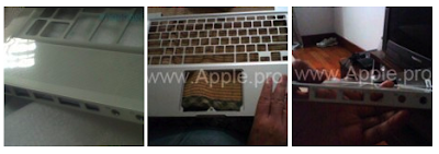
They now have the exact same aluminium case, glass display and button-less mouse trackpad. The differences come down to screen sizes/resolutions and in the internal components, wherein the Macbook Pro has a more powerful CPU, GPU and RAM. If you're looking for some pictures of the new machines "in the wild", check them here and here.
Regarding the common points, one of the most interesting aspects of the new Apple's notebooks is the multi-finger button-less glass mouse trackpad. With a set of new gestures (check a video here) this trackpad allows greater control of Mac OS X's features, such as picture navigation, zoom and rotation, app switching and access to Exposé. Also, the entire trackpad is a mouse button, which means that this might actually satisfy Greeks and Trojans. For those that don't like buttons in the trackpad...well, they aren't actually there. For those that do...well, it's there :-)
Another interesting aspect is the new case, which besides being made from a new innovative manufacturing process that is "greener", allows the new Macbooks to be lighter, stronger and slightly thinner. The other aspect regarding the design of the new Macbooks is the choice of glass for the screen display (without a matte finish). This decision, I have to say, is quite disappointing. I've been using laptops for quite some time now and one thing I've learned is that glass displays are quite annoying when you're trying to use your computer outside.
Even though I like the innovation that Apple introduced with these new Macbooks, this one decision would be enough to keep me from buying one of these new notebooks. Well, at least until I have the chance to be face-to-face with one of them and check this new display's performance outside :-)
The older Macbooks and the Air
Apple has decided to still keep the older versions because they know that there are still some fans out there. For the Macbook, they kept the good'old white version (the most best-selling Mac ever) with a $100 price reduction and for the Pro, the 17'' version of the Macbook Pro is still there, which means Apple is still proud of that powerful notebook that is easy to carry everywhere.
The Macbook Air was not forgotten and it also got a boost on speed (new CPUs and GPUs) and storage (120 GB HDD for the cheaper version and a 128 GB SSD for the richie rich version).
About the other rumours
Steve Jobs has also made clear that there are three things that Apple won't step into, at least in the foreseable future:
- Touch-screen notebook - The Mac that we're all waiting for, won't be one of Apple's priorities since Steve Jobs has made clear that "it hasn't made a lot of sense to" Apple.
- Blu-Ray - Don't expect to see Blu-Ray drives in future Macs. Jobs described it as "a bag of hurt." I don't quite understand what this means, but he probably has his reasons for believing that.
- Netbook - If you're into netbooks, be advised that Apple won't be entering this market in the short term. But at least, Steve Jobs has made clear that Apple will "see how it goes" and...who knows, perhaps Apple will finally release a $400 or so netbook.
About Steve Jobs' Health
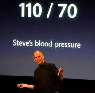
No, Steve Jobs is not dead...yet. And it's good to see that he can still have some sense of humour regarding all the news about his health.

Posted by
António Lopes
at
17:03
0
comments
![]()
Labels: good things, images, news, reviews
12 October 2008
The new Macbooks
As you may have heard, Apple is rumoured to release new notebooks on Tuesday, October 14th. And the million dollar question is: "How will these new Macbooks look like, what features will they have and how much will they cost?"
The Cult of Mac has a great post that tries to answer this question. Here's their potential set of features for the new Macbooks:
- Penryn Core 2 Duo chips: 2.4GHz, 2.66GHz, 2.8GHz, and 3.06GHz.
- 2GB of RAM (MacBook); 4GB of RAM (MacBook Pro).
- Hard drives: 160GB — 320GB.
- Glossy widescreen TFT screens. On the MacBook: 13.3-inch (1,280×800 resolution); MacBook Pro: 13.8-inch (1,366×768).
- Integrated NVIDIA graphics system.
- New, all-aluminum enclosures, white, black and silver.
- Enclosure is tapered: very thin at the sides, thicker inthe middle, like the iPhone 3G and MacBook Air.
- Magnetic lid latch on all models (replacing mechanical clasps on the MacBook Pro).
- All ports on left side — including FireWire 800.
- Slot-loading optical drive on right (no Blu-ray).
- Extra-large battery pack running full width of computer at the front, under the touchpad.
- Recessed keypad like MacBook Air. Keys are Chicklet style on MacBooks, black and backlight on Pros.
- Price: Starting at $800. This is the mysterious “product transition” that Apple CFO Peter Oppenheimer said in July would impact Apple’s gross margins.
 But as every Apple rumour, it's always difficult to know exactly what to expect and as new images of how the new Macbooks will look like are released across the entire web, the hype will grow. And every doubts will be shatered on Tuesday. Let's wait and see.
Posted by
António Lopes
at
20:18
0
comments
![]()
Labels: good things, images, news
7 October 2008
How to create programs that make use of the potential of your Macbook Pro
If you have a Macbook Pro, chances are that you've already made use of some of the unique functionalities that this great Apple laptop has, such as the Sudden Motion Sensor or the Ambient Light Sensor.
For example, here's a list of cool apps that use the Sudden Motion Sensor:
- AMSVisualizer - Just a simple app that allows you to view the behaviour of the sensor
- LiquidMac -Play with fluids...not real, don't worry
- MacSaber - for the Star Wars fan
- netPong - use your Macbook Pro as your board
- Stable Window - another simple app to see the behaviour of the sensor
Try them out. They should be simple enough to the experienced programmer.
Posted by
António Lopes
at
18:20
0
comments
![]()
Labels: applications, good things, tips
